White pendant lighting has quietly become one of the most versatile fixtures in home design, not because it’s trendy, but because it works. Whether hanging over a kitchen island, flanking a dining table, or clustered in an entryway, white pendants deliver focused light without fighting for visual attention. They blend into minimalist spaces, soften industrial rooms, and anchor farmhouse kitchens. But choosing the right fixture means more than picking a color. Size, placement, bulb type, and room function all matter. This guide walks through what makes white pendants effective, where they work best, and how to install them without second-guessing the height or wattage.
Table of Contents
ToggleKey Takeaways
- White pendant lighting offers versatility across design styles by reflecting more light, hiding dust, and working with any bulb temperature without competing with seasonal decor or room colors.
- Proper sizing and placement are critical—use the 1/3 to 1/2 island width rule, hang fixtures 30–36 inches above work surfaces, and space multiple pendants 24–30 inches apart to avoid shadows and safety hazards.
- White pendants perform best in kitchens, dining rooms, bathrooms, and entryways where task lighting and clean aesthetics matter, but are less ideal in bedrooms and media rooms that require softer indirect lighting.
- Match the pendant’s finish and undertone to your room’s largest neutral surface—matte white or cream pairs with warm woods, while glossy white suits cool grays and modern spaces.
- Pair white pendant lights with appropriate bulb temperatures (2700K for warmth, 4000K–5000K for crisp clarity) and layer them with under-cabinet or ambient lighting to create functional, layered illumination in workspaces.
Why White Pendant Lights Are a Timeless Design Choice
White pendant lights don’t demand attention, they distribute it. Unlike colored or metallic fixtures that can clash with seasonal decor or trend cycles, white integrates across styles. A matte white drum pendant fits in a Scandinavian living room just as easily as a glossy white globe suits a mid-century kitchen.
From a practical standpoint, white reflects more light than darker finishes. A white interior on a pendant shade bounces illumination downward and outward, reducing shadows and improving task lighting efficiency. This matters in kitchens, where countertop prep work benefits from even, diffused brightness.
White also hides less. Dust and grime show up faster on matte finishes, which means homeowners stay on top of cleaning, a small maintenance nudge that keeps fixtures looking intentional rather than neglected. In open floor plans where sightlines span multiple rooms, white pendants create visual continuity without adding color competition.
Finally, white works with nearly any bulb temperature. Pair it with warm (2700K–3000K) LEDs for a cozy dining area or daylight (5000K) bulbs in a workshop. The neutral shell doesn’t tint the light output, unlike amber glass or colored metal shades that shift color rendering.
Popular Styles of White Pendant Lighting
Modern and Minimalist White Pendants
Modern white pendants lean on clean geometry and understated materials. Expect blown glass globes, powder-coated aluminum drums, and smooth ceramic cylinders. These fixtures often use a single canopy mount and a simple cord or rod, keeping the visual weight low.
Common profiles include:
- Globe pendants (6″–12″ diameter): Frosted or opal glass diffuses light in all directions. Works well in clusters or along a hallway.
- Drum shades (10″–18″ diameter): Fabric or metal cylinders with open top and bottom. Provides downlight and ambient glow.
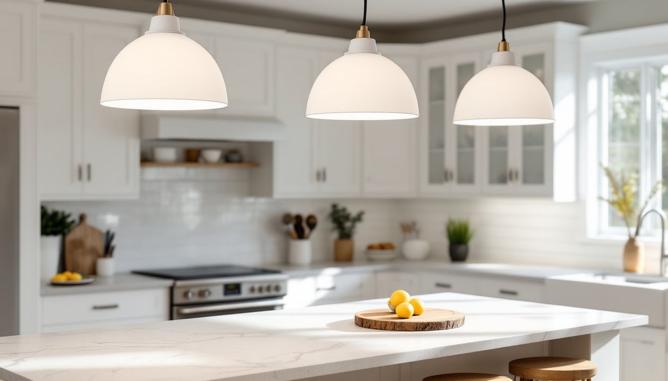
- Cone or bell shapes: Directs light downward for task lighting. Popular over kitchen islands and workbenches.
These styles pair well with matte black or brushed nickel hardware for contrast. Installation is straightforward, most use a standard junction box and weigh under 10 pounds, so no additional bracing is needed.
Farmhouse and Rustic White Pendant Fixtures
Farmhouse white pendants add texture and vintage detail. Think enamelware barn lights, distressed metal shades, and wire cage guards. These fixtures often come in porcelain enamel over steel, durable, easy to clean, and true to historical industrial lighting.
Popular features:
- Gooseneck arms: Wall-mounted pendants with adjustable arms, common in kitchens and mudrooms.
- Ribbed or fluted glass: Adds subtle pattern without busy color.
- Exposed Edison bulbs: Warm filament bulbs (40W–60W equivalent) soften the utilitarian look.
Farmhouse pendants tend to be heavier, 8 to 15 pounds, so confirm the junction box is rated for the load. If the existing box is plastic and lightweight, swap it for a metal pancake box or ceiling fan–rated box before hanging the fixture. Wiring is identical to modern pendants: black (hot), white (neutral), and bare copper (ground).
Choosing the Right Size and Placement for Your White Pendants
Size and placement mistakes are the most common DIY regrets with pendant lighting. Too small, and the fixture disappears. Too low, and it’s a head hazard. Too many, and the ceiling looks cluttered.
Sizing by room or surface:
- Kitchen island: Pendant diameter should be 1/3 to 1/2 the width of the island. For a 36″ wide island, use 12″–18″ diameter fixtures.
- Dining table: Measure the table’s narrowest dimension, then choose a pendant that’s 1/2 to 2/3 that width. A 40″ round table pairs well with a 20″–26″ fixture.
- Entryway or stairwell: Add room length and width in feet, then convert to inches for pendant diameter. A 10′ × 12′ foyer suggests a 22″ fixture.
Height and clearance:
- Hang pendants 30″–36″ above a kitchen island or counter. This keeps the light out of sightlines but focused on the work surface.
- Over a dining table, aim for 30″–34″ above the tabletop. Taller ceilings can go higher, but avoid exceeding 36″ or the light becomes ambient rather than task-focused.
- In open stairwells or two-story entryways, ensure the bottom of the pendant clears 80″ from the floor per IRC minimums (though local codes may vary).
Spacing multiples:
When hanging two or three pendants in a row, space them 24″–30″ apart, measured center to center. For a 72″ island, two pendants work at 24″ from each end, with 24″ between them.
If the island is longer than 6 feet, consider three pendants to avoid dark spots. Always center the group over the island, not over each individual task zone.
Best Rooms and Applications for White Pendant Lighting
White pendants excel where focused light and clean aesthetics overlap. Here’s where they perform best:
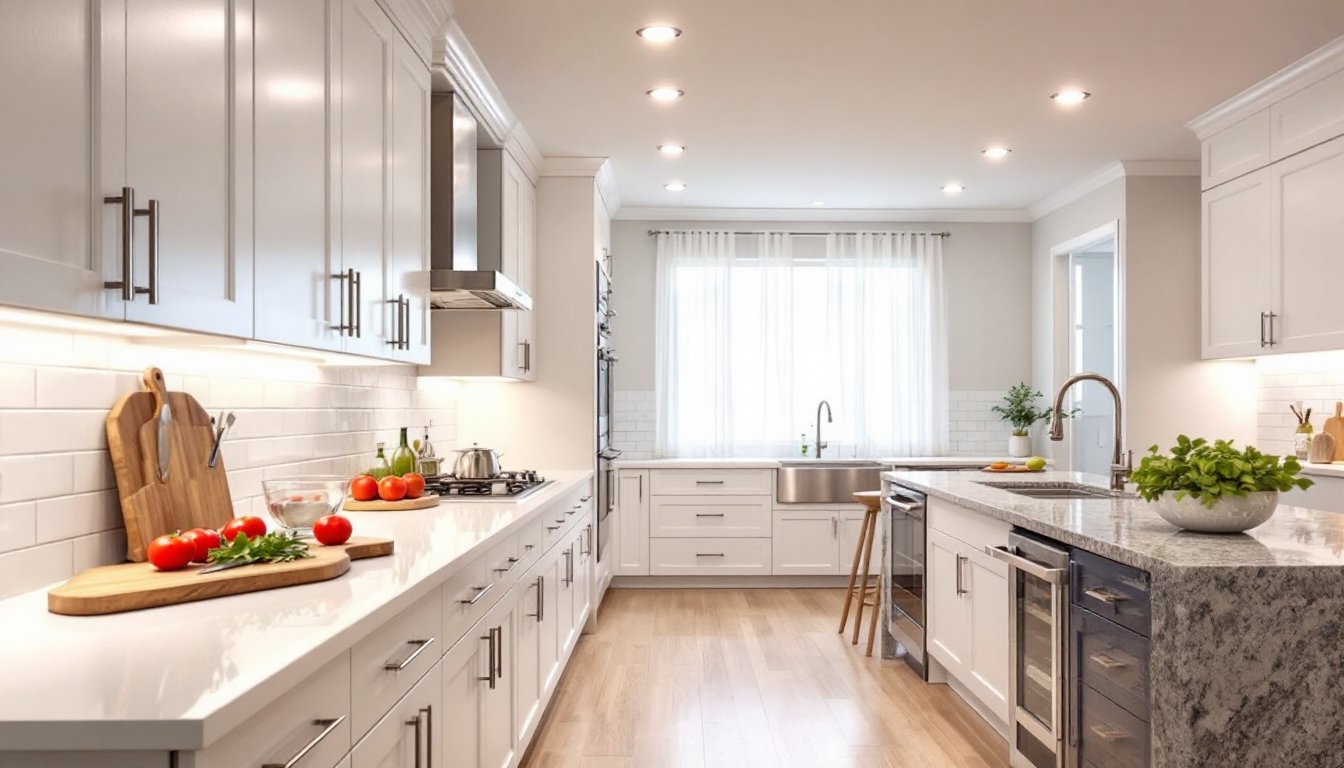
Kitchen islands and peninsulas: Task lighting over prep areas is the most common use. White pendants with downward-focused shades (cones, domes, or barn lights) deliver 50–75 foot-candles at the counter when fitted with 60W-equivalent LED bulbs. Pair with under-cabinet lighting for layered illumination.
Dining rooms: A single statement pendant or a linear cluster creates a focal point without competing with table settings. Dimmable bulbs let homeowners adjust for meals versus assignments.
Bathrooms: Small white globe or cylinder pendants work in place of vanity bars, especially in modern or coastal designs. Mount them 75″–80″ above the floor and at least 3 feet from the tub or shower to meet NEC wet location requirements. Use a damp- or wet-rated fixture if the pendant hangs within the tub or shower zone.
Entryways and hallways: A single oversized pendant (18″–24″) in a foyer adds presence without furniture. In hallways, space smaller pendants (8″–12″) every 6 to 8 feet for even coverage.
Home offices and craft rooms: White drum or dome pendants provide diffuse, shadow-free light for detail work. Avoid bare-bulb fixtures, direct glare causes eye fatigue during long tasks.
White pendants are less ideal in media rooms or bedrooms where softer, indirect lighting is preferred. In those spaces, consider wall sconces or floor lamps instead.
How to Pair White Pendant Lights With Your Existing Decor
White is neutral, but not invisible. The shade’s finish, shape, and mounting hardware all influence how it reads in a room.
With warm woods and natural tones: Matte white or cream-colored pendants balance rich walnut, oak, or bamboo. Pair with warm white (2700K) bulbs to avoid a clinical look. Farmhouse enamel or ceramic fixtures add subtle texture that complements grain and patina.
With cool grays and whites: Glossy white or bright white pendants blend seamlessly. Use daylight (4000K–5000K) bulbs in kitchens or baths for crisp, accurate color rendering. Modern globe or drum shapes reinforce the clean palette.
With bold accent colors: White pendants act as visual breaks in colorful rooms. A navy kitchen with white marble counters benefits from white pendants, they tie the stone to the ceiling without adding more color. The same applies to green, terracotta, or charcoal accent walls.
With mixed metals: White shades pair well with mixed finishes. A white pendant with a brass canopy works alongside stainless appliances and black cabinet pulls. The white diffuses attention so the metal accents don’t clash.
With patterns and textures: In rooms with patterned tile, bold wallpaper, or textured fabrics, white pendants provide a visual rest. Choose smooth, simple shapes, ribbed glass or carved details add competing texture.
When in doubt, match the pendant’s undertone to the room’s largest neutral surface. If walls or cabinets have a warm off-white, choose a cream or ivory pendant. If trim and tile are bright white, go glossy or pure white. This keeps the fixture anchored rather than floating awkwardly between color temperatures.